
Communication is vital for organizations in achieving their goals, and one of the crucial tools to communicate effectively inside and outside of the organization is storytelling. This tool is applicable in every industry, and data science is no exception.
What is data storytelling, and why is it important? Simply said, data storytelling is a way to communicate more complex information to specific audiences with a compelling and effective narrative. Today, with the amount of data gathered by the companies, data storytelling can be a game changer for organisations because it merges three factors together: data science, visualization and narrative. Based on this, some of the benefits for the organization of using visualization and narrative to convey insights are:
- Identifying patterns and focusing on areas that need attention in the data to move their business forward.
- Analyzing data in a better and easy-to-understand way by interpreting and communicating the data in a clear and cohesive procedure.
- Make better decisions by spending less time analysing data through augmented decision-making.
- Increase the attractiveness among users by presenting data for an easy and quick interpretation and understanding.
Learn from These Good Data Storytellers
Visualization and narration are already part of everyday life through smart devices, applications and other ways to improve life. To better grasp that, we share use cases that will help you understand the power of visualization and storytelling.
One of the positive use cases is the German news company Der Spiegel. This company is trying to present emotions to their readers with Data Visualisation since, according to them, Data Visualization is more than mere line charts and puristic scatter plots. Der Spiegel has different types of Data Visualisation: simple graphics in print issues or on the website, customized graphics, drawn visualisation with online tools for both online and print issues or mobile phones or larger screens, as well as complex visualization so the audience can interact with it.
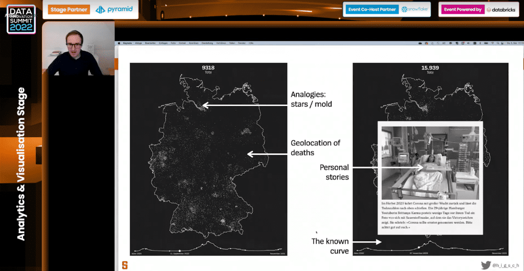
“Data Visualization is like a radio show. There is always a sender, a medium – website, paper, browser, document etc., and a receiver – people that read and see the Data Visualization. Since the sender does not have contact with the audience, it does not know who got it and what is the effect of the people reading or seeing the Data Visualization.”, says Matthias Stahl, Deputy Head of the Graphics Desk at Der Spiegel, who shared two examples of how this company is using Data Visualisation.
One example is an interactive map for the readers with the number of deaths in Germany from the coronavirus and additionally background stories with images and text. Another example is visualizing all the Nobel prize winners from 1901 and the German winners. You can find out how they did that by registering for Hyperight premium and listening to the presentation.
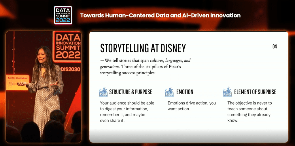
The Walt Disney Company has maintained the golden standard of storytelling for the last 100 years, and how the company applies that standard to data storytelling. Disney is one of the most data-driven entertainment companies. The company uses data to the way it prices hotels, the way it optimizes queue lines at the theme parks, the way it builds recommendation engines, the way it makes audience segmentation products, etc. The company is not just good at telling stories but also at using the data to tell better data stories and build better products. Usually, when the company has a stakeholder that doesn’t know anything about data science concepts but is interested in improving the revenue, the solution that the company proposes is turned into a narrative. The insights and visualization used to support that narrative are tailored to the stakeholders’ objective and relevant to the audience. The company talks about the algorithm only to the extent that the stakeholder and the audience understand data science.
“As long as you have something valuable to say, you have a story to tell”, started her presentation at this edition of the Data Innovation Summit, Daphne Cheung, Data Scientist at The Walt Disney Company and added: “With data storytelling, organizations can drive action. Action means the solution is implemented in a production environment. Action drives impact. Also, with data storytelling, organizations get buy-in. By telling stories and communicating effectively with non-technical stakeholders in an organization, it may bring back the resources and support that are desired. You can build the most complex data science algorithms and be super excited to show that to whoever may be, and nothing happens. Because as humans, we don’t invest in things we don’t understand. One of the best skills that data scientist can develop is the ability to generate excitement and passion around their work and excite other people about what they do.”
Proper visualization can significantly enhance a company’s success. Previously, we highlighted the remarkable example of Volvo Group, which effectively communicates the value of data through Data Visualization. In a company with about 100,000 employees and thousands of data sources, sharing the findings and turning them into business development and innovation is a challenge. But with ML and AI, advanced analytics and visualization, the company can better understand the data, predict, plan and make decisions, or solve problems.
Elin Allison, Head of New Product and Strategy, Data Insights at the Telia Company, a few years ago at the The Nordic Data Science and Machine Learning (NDSML) Summit, shared a great example of how Telia combines AI on real world data generated by their mobile networks and visualization to enable better decision making across many sectors, such as public transportation, retail, tourism and events and municipalities.
Available Tools and Needed Skills
Visualization, as one of the elements of the data storytelling, should be driven by the data and the story, as opposed to what looks nice and is suggested to you by someone. Knowing this, there are many tools organizations can use for Data Visualization. Here are some examples:
- Coding Languages: D3, R, Python
- Dashboarding Tools: Power BI, Tableau, Google Data Studio, Qlik
- Browser-based Tools for Interactive Visualisations: Datawrapper, Flourish, RAWGraphs
- Infographics: Canva, Infogram, Adobe Creative Suite, Venngage
- Drag-and-Drop Tools for (mostly) Static Visualisations: Excel, Google Sheets
Regarding the skills and knowledge required to create practical and helpful charts there are many confusions. According to Nick Desbarats, educator and consultant at Practical Reporting Inc., there are several skills needed to create charts that are truly effective and not misleading:
- Data Visualisation software expertise like Excel, Tableau, Qlik etc. The software expertise is necessary to create effective charts, but it is insufficient. There are many other skills and knowledge that are necessary.
- Organisations must know the nature of the data, what kind of data they will visualise, whether it is time series, parts of a total, many categories vs few, etc. For any data type that needs to be visualised, there are lots of ways to visualise it with.
- Spelling and grammar of Data Visualisation, which means how to choose the right chart type, colours, legends, scales, annotations etc. There are spelling and grammar guidelines that can help learn and create effective charts. These rules can not get through the software visualisation tool and must be learned as separate skills, which takes time.
- Knowledge of the audience – what it is expecting, what would they find surprising, what are specific prostatitis, what insights would they find helpful, what background knowledge the audience lacks, and what is the audience level of graphicacy. This information also can not be seen from the data or the software but from the audience itself.
- Knowledge of the domain of the data – where this data came from and how the domain of that data works, what is the “common knowledge” of the domain etc.
- Statistical knowledge – if an organisation doesn’t know the statistics that will be reflected in the charts, it is easy to make charts that misrepresent reality.
- Data handling/data cleansing – anyone that works with Data Visualisation knows that much time is spent on data cleansing and is aware of any problems and limitations with that data that can be reflected in charts.
However, the benefits go hand in hand with the challenges for organizations, when we’re talking about Data Visualization. The main limitations that organisations should be aware of are:
- Oversimplification of data. This can result in important pieces of information getting overlooked.
- Human factor. This may lead to a subjective approach by professionals that may use specific algorithms that highlight some information and do not use others.
- Reliance on visualisation. Consumers’ dependency on visualisation to interpret data and information leads companies to use analytical tools to stay competitive.
What’s Next in Data Visualisation and Storytelling?
Data Visualisation and the way organisations communicate with inside and outside audiences evolves, what trends should organisations follow and where? The NDSML Summit is where you can get first-hand insights and updates. Until then, we share the top three trends that we came across in our research:
- Video visualisation, video infographics, and video advertisements. According to a study, people retain data better with video. About 67% of participants in this study preferred to learn about through a video rather than pictures or text.
- Real-time visualisation. Static charts are slowly becoming the past because companies can detect problems in business strategy, customer retention and brand presence earlier with real-time visualisation. Two core components of real-time Data Visualisation are the Stream of Data and the User interface to access the data stream through visualisations.
- Mobile and Social Data Visualisation and Storytelling. Considering the increasing percentage of people accessing the Internet via mobile devices, it is certain that this type of Data Visualisation can be seen as a growing field of interest by organizations. For example, it can be used to reduce customer attrition and attraction and gain there.
What also can be interesting to think about is how data democratisation reflects on Data Visualisation and if Data Visualisation will be limited to data scientists and analysts. Think about that and share your insights and experience with our reader community via [email protected]
Feature image credits: Patrick Assalé on Unsplash


Add comment